Showing posts with label inspiration. Show all posts

Tuesday, July 23, 2013

My Work Environment


One of the questions I get asked a lot is "where do you work?" 

I work at home where I have an office designated for working that's separate from the rest of the house and only used by me. It's really comfortable, but I try not to relax in it and really treat it like I would if it were an office that I had to travel to every day to work. 

Here's a little tour. The pictures are a little fuzzy, because there was a problem with my camera when I took them, but they should give you an idea of what my work environment looks like. 

I'm very lucky in that my work area is huge, 32 feet by 24 feet in size. Above you can see most of it from the door that I enter to get here. 


Above is what looks like from that same wall, looking across towards my desk where I do all of my writing. 


Here's the view from the opposite corner. 


I keep the majority of the books I use as reference in my office. 


As well as some books that I don't use for work. 


This is the desk I write at. Usually it's covered with notebooks and other pieces of paper that have to do with various projects I'm working on. 


The two filing cabinets are full of ideas for things I want to write, some things I work on a little bit at a time, projects I've abandoned, and things I've finished. I have other filing cabinets that are just for finished projects. The bookcase next to the filing cabinets contains all of my notebooks which are full of ideas for various projects. 


I'm a big fan of classic horror movies, so I have some shelves filled with monsters. I have far more than could fit on these shelves, so I can only display part of my collection at any one time. 


My office has a second desk which overlooks the woods behind our house. This desk I use exclusively for creating the artwork that I make for gallery shows and other projects. 


On the other side of my art desk is another set of shelves full of monsters. The reason it looks so empty is that I had just packed up my collection of Batman toys which had filled it, and was still in the process of filling it with monsters. 


This sofa is a great place to do some reading, writing, watch a movie, or take a phone call or a nap. 


Opposite the sofa is a series of shelves housing some of the graphic novels I've accumulated over the years. there are also some robots, spaceships, and things from the Haunted Mansion at Walt Disney World. 


There's a large papier-mache octopus and a globe covered in sea monsters on the table at the other end of the sofa. 


This table was meant to also display some toys and statues from my collection, but wound up being used for other things such as this life-size coelocanth in progress. 


I try to surround myself with interesting things that will ignite my imagination, whether it's books, toys, artwork, or oddities like you see on this shelf. The only thing I don't like about this office is that the walls are slanted so that I can't hang framed artwork on them, nor can I put shelves against them that are more than a couple feet high, other wise my office would be completely filled with books, toys and art. 
Instead, I've had to hang my artwork on walls throughout the rest of the house.

What I do like about it is that no matter how bad the weather is outside, I never have to go out into it to get to work. I can even work in my pajamas if I want to. 


Wednesday, August 4, 2010

Special Guest Robert Pope on Drawing Comics -- Part 2


Above: Robert Pope hard at work drawing a page from one of your favorite comic books. Now he's going to tell us more about what goes into drawing a comic book story.

If you haven't done so already, make sure you read Part One of our Q & A with penciller extraordinaire, Robert Pope before we continue here with Part Two.


8. What goes into your decision making on panel layout? 

Amount of space needed for word balloons.  Juxtaposing camera shots to create variety on a single page (so that we see a close-up, then a medium shot, then maybe an extreme close-up, just to mix it up a bit.)  What the layout of the previous page was, so as to avoid repetition, unless the script's tone calls for it, as it sometimes can.

Above: Here is a page which shows what Robert means when he's talking about using close-ups, extreme-close ups, medium shots and long shots. The top panel uses an extreme close-up of the newspaper to bring us the details of the photograph and the accompanying headlines. The third panel is a medium shot showing the speaker at a podium on a stage. the flag is an important detail showing that this story takes place in England. The next panel of the speaker is a close-up used to show us the award trophy he is holding. The final panel is a long shot showing the speaker, the stage, the banner above him, the audience he is speaking to and a new character in the foreground. Credits to this story also appear in this final panel. Notice in all of these panels, Robert leaves plenty of room for dialogue balloons and the credits so that they don't interfere with the artwork, or the way that you read the story. 


9. Do you ever do things differently than what's in the script?

Very rarely will I deviate from the writer's intentions, and only for good reasons.  Sometimes, a certain shot is called for (long, close up, ect.,) and the nature of the characters will make this either impossible or clumsy.  For instance, a wide shot works well for showcasing a lot of characters from the chest up, or a panoramic take on a cityscape from the distance, but if you want to show a entire figure from head to toe vertically and spotlight something like clothing details, a medium-shot would be more in order.  

Sometimes very rarely I will be compelled to change something based on how I consider I "know" the characers.  I once drew a "Foster's Home for Imaginary Friends" story where, at the story's end, Bloo was supposed to punch Cheese in the face.  Even though they had been at each other throughout the story, I felt this oddly violent and out of character, as Bloo is, to my way of thinking, more of a sneaky slacker, mischief-maker and prankster.  I drew the panel with Bloo kicking Cheese in the butt, sending him flying.  The panel was much more tolerable drawn this way, as to my mind a kick in the butt seemed less violent than a punch in the face.  I e-mailed the page to my editor, noted the change, and offered to draw it the way the writer wanted it if I had overstepped my bounds.  My editor agreed that the face punch was too visceral, and the butt kick stayed.  This sort of correction is extremely rare.  

One thing that DOES force the penciller to tinker with the script on a fairly regular basis is a situation that happens when multiple characters are talking in a single panel and, reading from left to right, the character at the far left of the panel has to deliver another line of dialogue AFTER the character that is at the far right, which should be the natural "end" of the panel.  In this instance, I either have to A) make space in the layout for another word balloon and hope that the reader can follow the narrative flow in spite of having to double back "into" the panel, or B) break down the panel into two separate panels to ensure that the narrative flows correctly.  Obviously, "B" is a better solution, but it makes more work for the penciller as you have now added a new panel that must be shoehorned into the page layout and not require you to draw so small that the reader has to look at your art with an electron microscope to figure out what is going on.  


Above: Some panels taken from the Foster's Home for Imaginary Friends story "Color Me Bloo" written by Scott Cunningham, pencilled by Robert Pope, inked by Jeff Albrecht, lettered by Travis Lanham, colored by Heroic Age, and edited by Ian Saddler for CARTOON NETWORK BLOCK PARTY #45. Notice how Robert placed the characters in each panel so that their dialogue would read smoothly from left to right without crisscrossing word balloon tails. Even when characters speak more than once the arrangement allows for the balloons to be placed in such a manner that reading them is easy and not confusing. This is tricky for the artist and something the writer should also be thinking of when writing a scene. 


Further, it is also difficult when a character or characters in a single panel are written doing multiple actions.  This also happens quite often, as in "Page 1, panel 5:  Johnny Bravo runs down the street, bursts through the door of his home, and lifts his couch to look for his missing date."  This would work much better as at least two, or maybe even three panels.  

10. What are your favorite characters/ comic book to draw?

I love cartoony comics, and the Scooby gang are of course faves.  Working recently on "Batman the Brave and the Bold" has been great as well, due to the fact it's a weird hybrid of mainstream comic book theory and of course a translation of an animated property to the page, something I think I'm pretty good at.
I have drawn stories based on many animated shows:  Fosters Home, Grim Adventures, Johnny Bravo, Daffy Duck and Porky Pig, Foghorn Leghorn, Space Ghost Coast to Coast, and drawn covers featuring most of the "modern" Cartoon Network properties.  While they are all challenging, I love them all for various reasons.  


Above: The first story of mine drawn by Robert Pope featured Space Ghost for CARTOON NETWORK STARRING...#18. It was inked by Dan Davis, lettered by Ryan Cline, colored by Digital Chameleon, and edited by Joan Hilty and Harvey Richards. 

  
11. What comics did you read growing up? 

Carl Barks' Donald Duck and Uncle Scrooge.  Fantastic Four (John Buscema's run, I got my Kirby by way of Marvel's Greatest Comics, as I was born in '67)  Amazing Spider-Man, Any Gold Key comic I could find, most anything with Ben Grimm or Victor Von Doom or heck, Super Goof on the cover, any Richie Rich title, any Archie title drawn by Dan DeCarlo (I could tell) Herb Trimpe Hulk comics, Kirby's odd run back at Marvel circa '75, any Flash drawn by Carmine Infantino, Green Lantern as long as Joe Staton was pencilling, Superman, Batman if Don Newton or Dan Atkins or Jim Aparo were in there somewhere, Justice League of America (some fun runs by Perez, to be sure) and Wonder Woman when Ross Andru was pencilling.  And that's just the short list!


Above: A page from an Uncle Scrooge story written and illustrated by Carl Barks. 


Above: A Fantastic Four cover by John Buscema featuring both Dr. Victor von Doom and Ben Grimm, also known as the Thing. 


Above: Green Lantern by Joe Staton.


Above: Wonder Woman by Ross Andru. 


12. What made you decide to be an artist? 

I loved the medium, and could honestly do very little else.

13. What made you decide to draw comic books? 

I got in totally by accident, kind of sideways.  I got into animation in '88-'89, and some years later ('95) was animating for my pal C. Martin Croker, who was the animation director for the Cartoon Network show "Space Ghost Coast to Coast."  Some time after THAT ('99, to be specific) DC, by way of Cartoon Network, approached Clay about pencilling a adaptation of the show.  Clay, who is really an amazing talent, probably THE most naturally talented animator I know, knew he would need help, so he got me and animator Matt Jenkins (who had also animated on SG) to assist on the first issue, which was edited by the very great Heidi MacDonald.  I helped Clay on a couple of subsequent issues, we were co-pencilling, more or less, and when the work slowed, I approached then editor Joan Hilty (who was my first big booster at DC and incredibly patient with how stupid I was at the time) about additional work and ended up doing some sample pages for Scooby, among other things.  When Clay later wrote a Scooby script, I got to pencil it, and moved from there onto other properties, doing interiors and later cover, which I consider to be a lot of fun.  

14. How long does it take you to draw a comic book story? 

When I get the script, I read it the first night and do thumbnails.  Then I blow the thumbnails up to 1/2 size to create tiedowns.  I can do 5 of these in a night, so a 20 page book takes me 4 nights.  THEN, I take a night to rule boards and blow up the 1/2 up tiedowns at Kinko's.  Then onto the final pencils; I can pencil between 1/2 and 1 page a night, including spotting blacks.  So 20 pages takes me on average 23 or 24 days.  All in all, I average about 30 days to get through a full-length book, working 7 nights a week.  If I had the luxury of doing comics for my "day" job, I am sure that I would be much faster.  Whenever I draw on weekend days I am startled at how much faster I can produce.  However, starting in on pencilling after a full day of work and then dealing with family and other responsibilities means a drop in energy that inevitably takes a toll on speed, but hopefully not quality.  

15. Do you get to pick the inker? 
No, but over the years I have been asked my opinion on possible inkers by various editors, and this chance for input has been very gratifying.  My fave regular inker, Scott McRae, is a great artist and a swell guy.  And he doesn't cheat my details.  

Above: The cover to SCOOBY-DOO #118 by Robert Pope and Scott McRae.


16. Do you work at home? 

Yep, home studio.  I animate during the day in an office, but my comics are produced in the wee small hours, so being right there at home is crucial.


Above is the animation desk that Robert Pope works on when drawing comics at home. 


17. How long have you been working in comics?

Eleven years and counting.  Here's hoping for eleven more!


Thank you Robert Pope for taking the time to share so much valuable information with us. If you have any questions for him, please ask in the comment section below. 


Special Guest Robert Pope on Drawing Comics -- Part 1


Robert Pope is an animator and a fantastic comic book artist. Robert has provided the pencils for numerous stories that I have written as well as many more written by other people. You've probably seen his artwork on the covers and inside of comic books such as Scooby-Doo, Batman The Brave and the Bold, as well as stories featuring Dexter's Laboratory, Johnny Bravo, and Foster's Home for Imaginary Friends in Cartoon Network Block Party and Cartoon Cartoons


He has generously agreed to answer some questions about what it is he does as a penciller, how he works, what inspires him, and many other things. He's provided such great detailed answers that we can't fit them all into a single post.  Here is Part One. 


1.  How do you interact with the writer (if at all) the editor, the inker, letterer, and colorist?  

Most of my interactions are with the editor.  Typically, the editor will call me up and say he or she has a script that they think would work for me.  This can be due to any number of reasons, including the subject material, number of pages I can do in any given month, etc.  Sometimes I call the editor up and ask for work before they call me.  The editor describes the story to me over the phone, then they e-mail me the script for my review.  The editor tells me how long I have to draw the script, and once I have read through it if I need more time, I ask for it (usually no more than a day or two, sometimes an extra weekend.)  If I am given a long script, I will "feed" the editor pages in batches of five or ten, and upon his or her approval, ship those pages to the inker to keep the process in motion. 

 Most of the writers I work with have very specific visuals in mind, and often provide useful reference to help me "see" props, supporting characters, and settings.  Aside from reviewing these materials, I have not had much regular interaction with my writers over the years concerning scripts.  Sometimes, I will adjust panel layouts, move dialogue bubbles from one panel to another, break up a single panel into multiple panels and other small things to help the narrative flow and make for smoother reading and recognition.  If I become concerned that I may be altering or compromising the writers' vision, I'll shoot the editor a quick description of my intentions and make sure they're O.K. with my actions.  Usually, my goal is to get the writer's idea across in a way that's fun to read multiple times.  I think the best comics are the ones you can return to and keep finding new bits of visual and verbal interest. 

 If I have suggestions for the colorist, I usually send them via the editor, but unless I feel a panel or page has a very specific or necessary coloring effect, I have no stomach for telling other pros how to do their job.  My regular inker Scott McRae and I talk quite often, but again, unless I'm asking him something specific (like to fill a space scene with stars made of white correction fluid) I wouldn't presume to direct him.  Once the story is completed up to inking and lettering, the team (writer, editor, penciller, inker) get a copy via e-mail and have the chance for correction.  Usually, there are very few flubs, most often a dialogue balloon pointer aimed at the wrong character, something like that.

2.  What do you do when you get a script for a story?  

The first night I get a script (and it's always at night, comics are my night job!) I read the script all the way through, and note any reference I may need above and beyond what the writer has provided.  The internet, and specifically Google images, have made this much easier than it used to be as we now no longer need to keep massive "swipe files" [ a swipe file is a collection of reference material that artists collect. These are images of anything they might be asked to draw from horses and army uniforms to old cars and airplanes and monkeys and clothes from the 1500s or the 1960s] on hand at all hours to provide examples of the many new and different things we draw in our comics.  After I have read and re-read the script, I do thumbnail sketches [ a thumbnail sketch is a small (about the size of an adult thumbnail, or bigger) drawing without a lot of detail that artists use to try out compositions for finished drawings] right on the script page, just to get a sense of flow and to get a good idea of how much work each individual page will take.  After a few years, you get good at estimating how much energy certain things take to draw.


Above is one of Robert Pope's thumbnails for a panel with Bloo talking to Mac from a Foster's Home for Imaginary Friends story. There isn't much detail but it shows where the characters are in the panel and where the word balloon will go. It also show's Bloo's expression. 


3.  Does the finished artwork veer from those thumbnails?  

For a twenty page script, I figure on average I re-think at least one or two pages when I blow up the thumbnails.  But mostly, I stick with my first instinct, my first try.

4. For new characters do you do sketches of them separately, or do you just make them up when you get to them? 

If the character is going to appear in just a few panels, I'll probably make them up on the fly.  However, if he or she (or it) has a bigger role in the story and shows up repeatedly, I'll create a model sheet for myself to maintain the look throughout (recent stories like "Howling Good Time" and "Monster of 1000 Faces" had several important characters that popped up throughout and had to be very clearly defined-the director in "Monsters" was based on, in part, Jim Steranko!)  And of course the writer often has an idea of how these ancillary or new characters should look, and forward helpful reference.


Above is the real Jim Steranko, an innovative comic book artist best known for his work at marvel Comics in the 1960s. He also did some illustration work for the Indiana Jones movie Raiders of the Lost Ark


Here is the movie director from "Man of a Thousand Monsters" from SCOOBY-DOO #145. Do you see the resemblance? 


5. What about backgrounds, props and locations? 

I like to get as much reference as I can stomach before I begin and really absorb it.  Some stories are fun to draw because the backgrounds are vague and nondescript enough to allow you to concentrate on the characters themselves and their "acting."  DC editor Joan Hilty considered any Scooby story that featured a beach practically a gift to the penciller, because it's something that's very easy to draw.  I am not one of those cartoonists who can draw much "out of my head," and reference plays a BIG part in my work.  Unless it's a very imaginary setting, prop, or set piece, I feel better with reference.

6. Do you have favorite things you like to draw? 

I love drawing characters in motion.  I have staged Shaggy and Scooby running from ghosts and monsters more times than I can count, and I always love the challenge.  Same with Batman swinging or throwing a punch.  I love drawing characters that are more or less grounded in reality, but still very cartoony.  The great designer Iwao Takamoto, who worked for both Disney and later as Hanna-Barbera's main man for character design, was one of my big heroes and best personified this kind of cartooning.  His creations are both cartoony and realistic at the same time, sort of like Alex Toth, but even more rubbery and skewed for animation.  As the bulk of my career has been translating animated characters to the printed page, my personal "style" has been deliberately subverted and it's main outlet is in the elasticity and momentum of the characters themselves.  

7. Things you hate to draw? 
Buildings.  Cars.  Crowd scenes with masses of incidental characters that are both generic and specific at the same time.  Most of my heroes or influences (with the exception of Charles Schulz) were cartoonists who filled the page with copious amounts of details both relevant and incidental (Jack Kirby, John Byrne, George Perez, John Romita Sr., to name a few) and while I love packing in the bells and whistles, it certainly can be regarded as much more like work than staging the foreground characters.


Above is a panel where Robert Pope really packs in the details. This is also from "Man of a Thousand Monsters" from SCOOBY-DOO #145.


Before we continue, here is some information about the people that Robert mentions in his responses to questions  6 and 7. 

Iwao Takamoto (1925-2007) worked as an animator on Disney movies such as Cinderella and 101 Dalmations, but is best known for designing the characters on Scooby-Doo, as well as Astro on The Jetsons. He also directed the animated adaptation of Charlotte's Web.


Alex Toth (1928-2006) was a comic book artist and a character designer for animated television series such as Space Ghost, The Herculoids, Jonny Quest, Super Friends, and other "realistically' styled shows. He drew in a very clean high contrast style using mostly white and black, and is a favorite of many comic book artists and animators. You can see some of his character designs below.


Charles Schulz (1922-2000) was the creator of "Peanuts" the long running newspaper comic strip starring Charlie Brown and Snoopy.


Jack Kirby (1917-1994), John Byrne (b. 1950), George Perez (b. 1954), and John Romita Sr. (b. 1930) are all comic book artists popular for their styles of drawing and their approaches to visual storytelling. Some exciting panels by Jack Kirby can be seen below.


Check back tomorrow for part two with Robert Pope!

Tuesday, June 29, 2010

Ray Harryhausen


This falls under the category of inspiration. When I was a kid I watched a lot of movies. The movies I liked best were the ones that featured special effects by Ray Harryhausen.

In the days before computer generated special effects, everything had to be done by hand. Spaceships and fantastic cities had to be made, either as miniature models or full sized sets. Strange creatures were either realized by an actor wearing a costume, or the way Ray Harryhausen did it which was through stop-motion animation. Stop-motion animation is similar to the animation that you see in cartoons, such as "101 Dalmations" or "Cinderella," only instead of using a series of slightly different drawings filmed in sequence to create the illusion of movement, in stop-motion animation you are moving a solid three dimensional object.


Ray would create miniature set pieces which he made to match the full sized sets used by actors. He'd position these sets in front of a small movie screen on which a single frame of the already filmed scenes from the full size sets so that the two blended seamlessly together. Then, he would take a miniature creature, skeleton, or dinosaur and position it so that it appeared to be interacting with the live action actor projected on the screen. He'd then photograph this new combination using one frame of movie film. He'd then advance the film projected on the screen one more frame, carefully adjust the position and pose of the miniature creature very slightly and photograph that new pose with a single frame of movie film. After hours of work and twenty four of these actions had been repeated he'd have exactly one second of film. Of course for a feature length movie of about ninety minutes in length, Ray had to create many, many minutes of animation, each minute equalling sixty of those seconds of work, or 1440 single frames, or adjustments for each minute of film.

His work required a lot of patience, and he also had to keep in mind what the entire action of the creature would look like projected at normal speed in the finished movie, so that it appeared not only natural, but as a living, breathing creature with its own distinct personality when people later watched the movie. If he made a mistake, such as bumping the miniature, or knocking over the creature, he'd have to start all over.


For me, his movies were, and still are, complete magic. When I was a kid, there was very little written about how special effects in movies were made, and most of what was written was wildly inaccurate. It wouldn't be until "Star Wars (episode IV-A New Hope)" was released in 1977 that special effects secrets would suddenly get a lot of attention. As a kid, I understood that when I saw the Wolfman, or the Frankenstein monster I was really seeing an actor wearing incredible make-up, but Ray Harryhausen's creatures and dinosaurs were definitely not actors in costumes. They were something else entirely, but they seemed to be very real and very alive. I was even more impressed with them once I knew how they were created.


I did make some stop-motion animated films of my own beginning in junior high school, but never became a professional stop-motion animator. Even so, there are lessons I learned from the work of Ray Harryhausen that I've brought to my work in comics. The first thing I learned is that if you are going to tell stories using non-existent creatures in them, it's incredibly important to make them seem real. You need to convince the reader that these are living, breathing creatures with their own personalities and behaviors, that live in their own habitats and behave in a manner that suggests that they are interacting with their world in a believable way. Ray learned this from another stop-motion animator named Willis O'Brien who was responsible for the special effects in the original (and best) "King Kong" (1933). In "King Kong" there is a famous scene in which Kong fights an allosaurus. O'Brien could have just had the two creatures grapple with each other and still impressed people, but he went an extra step. Not only does Kong use wrestling and boxing moves to fight the dinosaur, but my favorite detail is the way the allosaurus swishes its tail back and forth when it's getting ready to pounce. O'Brien made his stop-motion puppets characters and actors, something Ray Harryhausen did as well. My favorite detail of Ray Harryhausen's is in "20 Million Miles to Earth" (1957).  It's a scene where someone turns on a light and disturbs the baby alien Ymir, who blinks and starts rubbing his eyes at the brightness of the light. This detail makes the Ymir seem even more like a living creature reacting with its environment.


The second thing I learned from Ray Harryhausen is that your work and your play don't have to be two different things. As a writer, or any kind of artist, your workday never really ends. Even if you are not actively writing, or drawing, or playing music, you are thinking about it, generating ideas, and reading, watching and encountering things that might inspire your next big idea. I write about the things that I enjoy when I'm not working, and enjoy the sorts of things I write about when I am.


Today is Ray Harryhausen's 90th Birthday. If you've never seen one of his movies then watching one is a great way to celebrate. I recommend "The 7th Voyage of Sinbad" and "Jason and the Argonauts" most of all. While you're watching, pay special attention to the creatures in the movie and try to notice details about how Ray Harryhausen made them seem like they were alive and not just moving.

You can also see all of the different creatures that Ray Harryhausen has animated by going here. By clicking on the photos you can see brief bits of animation for each creature.


Here are some of Ray Harryhausen's other movies you might enjoy:

"Mysterious Island" (1961)
"First Men in the Moon" (1964)
"Mighty Joe Young" (1949)
"The Beast from 20,000 Fathoms" (1953)
"One Million Years B.C." (1966)
"Clash of the Titans" (1981)
"The Golden Voyage of Sinbad" (1974)
"Earth Vs the Flying Saucers" (1956)

Tuesday, June 8, 2010

Behind the Scenes of "The Missing Mummy Mystery"


"The Missing Mummy Mystery" appears in SCOOBY-DOO #156 which can probably still be found at your favorite place to buy comics. I wrote this story. Scott Neely drew the art. Heroic Age colored it, and Travis Lanham provided the lettering. Harvey Richards was the editor.

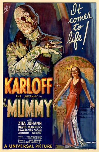
A couple of posts back, I mentioned my fondness for old monster movies and how I liked reference them in various Scooby-Doo stories. "The Missing Mummy Mystery" is no exception. As you might have guessed, for this story, my inspiration came from "The Mummy" (1932).


This movie features Boris Karloff as a living mummy who believes that the woman he loved thousands of years ago has been reincarnated as a modern day woman. The most famous scene from the movie comes near the beginning when an archeologist played by Bramwell Fletcher translates an ancient scroll which brings the mummy to life. The mummy shuffles over to him, takes the scroll, and shuffles away leaving the poor archeologist cackling with insanity. When his fellow archeologists ask him what's wrong he points to the empty sarcophagus and declares "He went for a little walk" before cackling with madness once more.


That very scene (shown above) was what inspired the entire story of "The Missing Mummy Mystery" and the idea of a valuable mummy seemingly vanishing from a museum collection by simply walking out the door under his own power. I also included a similar scene in which the night security guard, David Manners, stumbles across the walking mummy.


I also named several characters after characters and actors from "The Mummy." First was David Manners, the night security guard. In the movie, David Manners played Frank Wemple, son of Sir Joseph Wemple. David Manners was also in the movie "Dracula" (1931). Here's David Manners in "The Mummy."


Below you can see David Manners as the night security guard, along with Sir Wemple the museum director as they appeared in the comic book.


I named the daytime security guard, Steve Banning, after a character from "The Mummy's Hand" (1940) which also featured a living mummy on the loose. Steve Banning was an adventurous archeologist played by Dick Foran. Here's what he looked like in the movie. (He's the one NOT wrapped in bandages).


Here he is as he appears in "The Missing Mummy Mystery."


Now you know the story behind the story "The Missing Mummy Mystery."